Robbins Brothers eCommerce Experience Redesign
from low level interim lifts to complete rebranding and redesign of the entire digital experience.

Introduction
Overview
Robbins Brothers is a jewelry store specializing in engagement rings and has been in business since 1921. Robbins Brothers has store locations in California, Arizona, Texas, and Washington.
The Challenge
The company had just declared chapter 11 and was in need of improving its web-to-store conversion. The pre-existing website met the usability needs and allowed users to accomplish their search tasks, but lacked the emotion you’d expect from an engagement ring store. The website looked dated, sterile, and unemotive; requiring a low-effort (MVP) solution.
Role, Scope & Constraints.
My role was product manager and UX designer/dev. I created new style guides, carried out research, created wireframes, and mockups leading us to a total redesign of the digital experience. This involved selecting fonts, designing mockups, and also providing CSS for the development team. I worked with the creative team for the final CLP banner, and the dev team for access to a sandbox where I could implement a sample of the website with the updated stylesheets and assets.
The Process
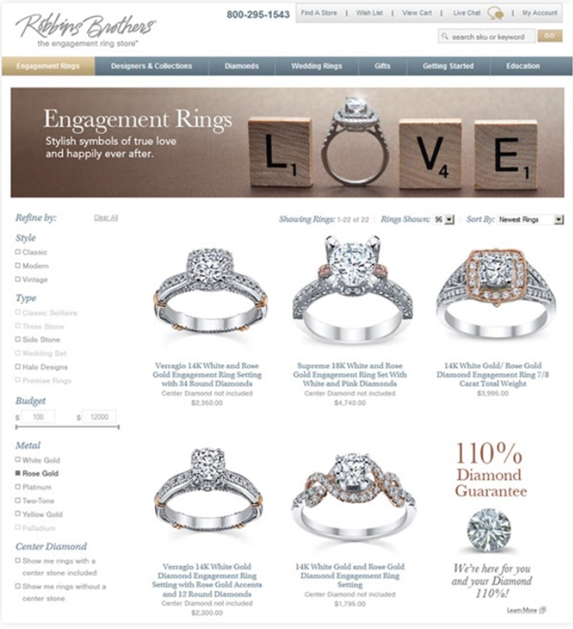
The process toward a complete redesign was iterative. We would begin with a low effort redesign of the current UI layer, without touching much of the codebase. In this first phase all that would be required would be to recenter the focus of the design on the products themselves, I removed the borders on the rings and used Gestalt principles to create product tiles by using padding and spacing to create a visual grid with less clutter and easier to digest cognitively.
The second phase was much more involved and required cross functional support from creative, IT, call center, and the executive team. This involved multiple rounds of approvals, brainstorms, and focus groups.
The Research
Competitive and comparative analysis
It was critical to understand the user’s mental model. For this we undertook a weighty investigation of the company’s competitors as well as a deep dive into a female psychology of the engagement and wedding space (ie, pinterest was our friend).
Competitors
Kay Jewelers, Zales, Blue nile, Shane & Co., Jared and Tiffany for a more aspirational approach to design.
User & Brand Perception Testing
User testing was carried out to see how users responded to the redesign at various points in the design journey.
Results & Findings
Our team found that users responded well to : Sepia toned photography, Serif- fonts, and photography which included couples faces to activate the Fusiform Facial Area of the brain which responds to faces and increases engagement.
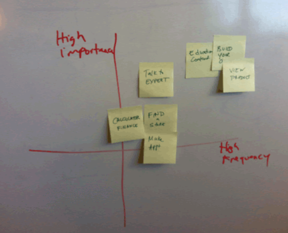

Design Iterations
Paper Sketching & Prototype | Medium Fidelity Wireframes | Hi-Fi Mockups
This was the preexisting eCommerce Catalog

A quick sketch from my physical notepad
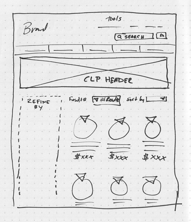
A rapid prototype for the first phase redesign.
I chose a hybrid approach and used screenshots of preexisting sections of the site.
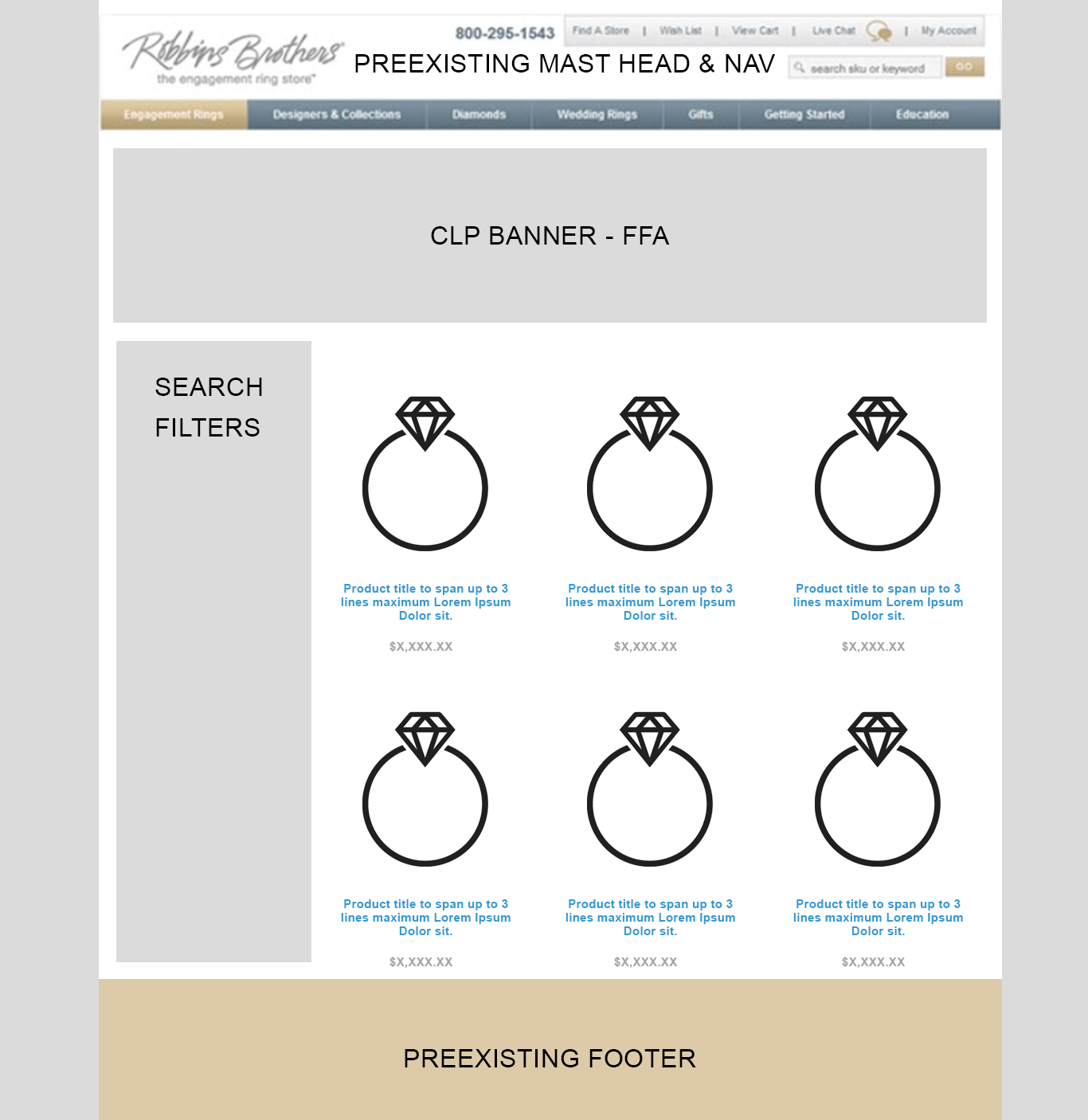
The first phase redesign deliverable
The Final Product
After many rounds of research, design huddles, development reviews, and executive signoffs, the final product arrived and it performed great! Conversion increased 300% and our website became a new standard among competitors. Imitation is the greatest form of flattery.
